


 Seattle
- 경제
Seattle
- 경제
Here’s the English translation of the article: Title: Korean Air Unveils New Logo After 41 Years… Fuselage Features Only ‘KOREAN’


사람·사람들
more
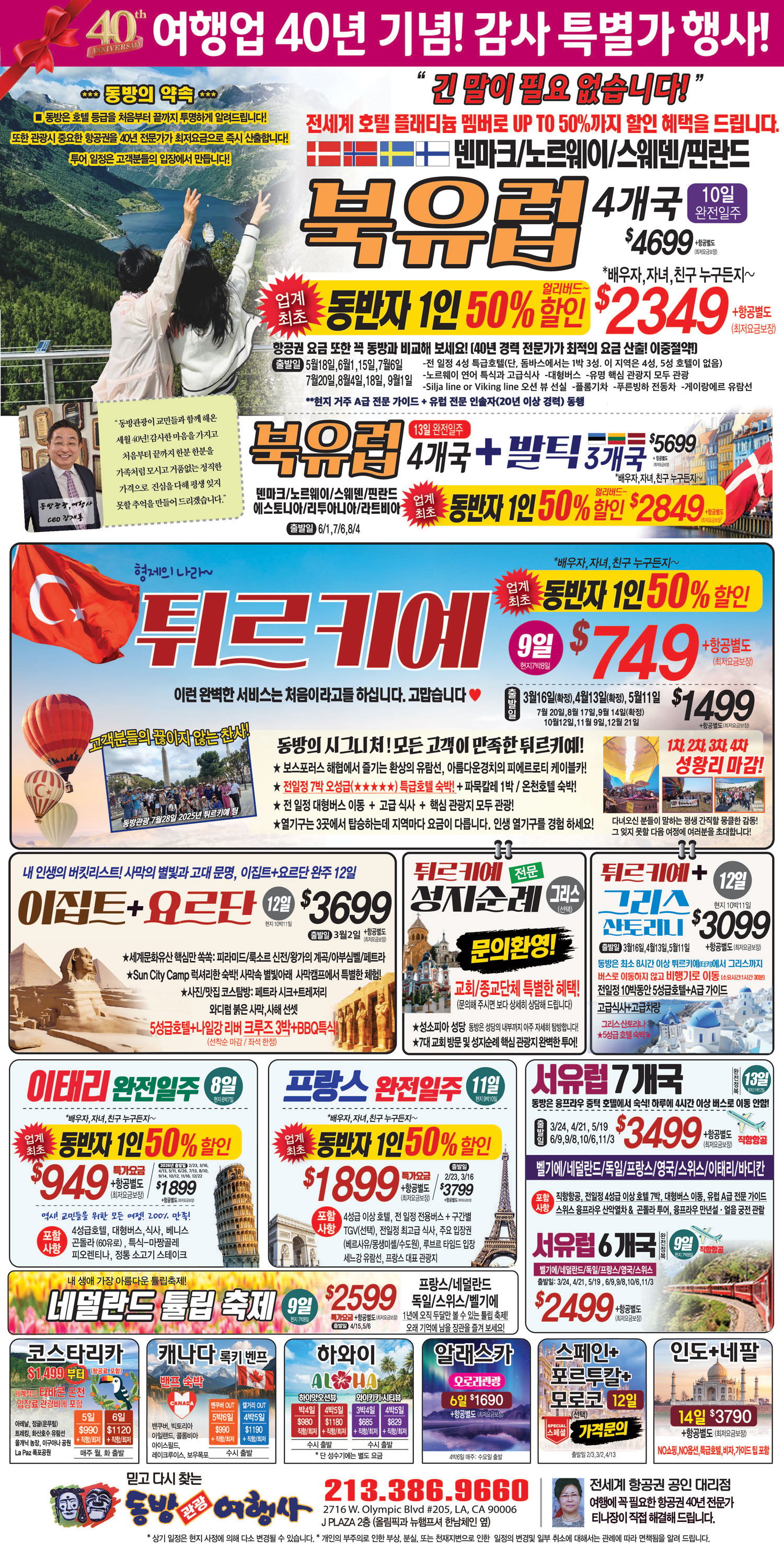
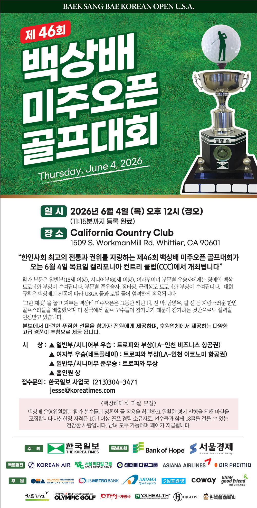
남가주 최강 골프 모임 ‘KAGA’… 백상배 전원 도전
남가주 한인 골프계에서 ‘가장 실력 있는 골퍼들의 모임’으로 불리는 ‘미주한인골퍼모임(KAGA·회장 윤규현)’이 오는 6월 4일 열리는 제46…

한인 고교생, 세계적 체임버 음악 콩쿠르 정상
남가주 한인 고교생이 세계적인 권위의 챔버 음악 콩쿠르에서 우승을 차지했다.주인공은 노스할리웃 고교 수재 매그닛 프로그램 10학년에 재학중인 …
청소년 ‘통일골든벨’ 내일 LA 평통 주최 1
LA 평통(회장 장병우)가 16일(토) ‘2026 민주평통 청소년 통일골든벨 퀴즈대회’를 개최한다.이번 대회는 미주 지역 중·고등학생과 한국학…
“K-민주주의 기리는 축제” 4
왼쪽부터 정성업 남가주 호남향우회장, 김철웅 LA 5·18 기념사업회장, 이사효 음악총감독.오는 18일 ‘5·18 광주민주화운동 46주년 기념…
코윈 퍼시픽 LA, 5월 월례회
세계한민족여성네트워크 퍼시픽 LA(KOWIN 퍼시픽 LA·회장 조미순)가 지난 6일 LA 아로마센터 5층 뱅큇홀에서 5월 정기 월례회를 개최했…


- 1
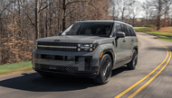
 5시간 넘게 줄 서서 먹더니 본토서는… 1
 - 2
 “트럼프 보디랭귀지, 시진핑과 친구되고 싶어…
 - 3
 미중정상회담 끝나자마자 中, ‘美호르무즈 결…
 - 4
 트럼프 “대만에 무기 팔수도, 안 팔수도…대…
 - 5
 강남역 사건 10년… 국가는 여성혐오 또 숨…
 - 6
 삼성 사장단·노동장관 평택 달려갔지만 ‘빈손…
 - 7
 미중 ‘베이징 노딜’
 - 8
 “집 사기 위한 저축계획 짜줘”…챗GPT, …
 - 9
 ‘중국 권력 심장부’ 중난하이서 차담
 - 10
 트럼프 전방위 압박에…민주당 주지사, 선거 …
- 11
 트럼프 “대만에 무기 팔수도, 안 팔수도…대…
 - 12
 “엄마 아빠 없어 슬퍼” ‘故최진실 딸’ 최…
 - 13
 “사유는, ‘국세 체납’”.. ‘유튜버 데뷔…
 - 14
 “또 A학점? 믿을 수가 있어야지”…챗GPT…
 - 15
 대만 “미국 무기의 대만 판매는 미국법에 명…
 - 16
 6·3 지방선거서 기초단체장 3명·지방의원 …
 - 17
 ‘징역형에 군 면제→출소 후 또 음주운전’ …
 - 18
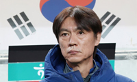
 ‘드디어’ 홍명보호 월드컵 최종 명단 발표 …
 - 19
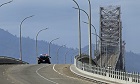
 덜레스 공항 220억 달러 재건축
 - 20
 트럼프 “시진핑, ‘대만공격시 美대응’ 내게…
- 21
 “시진핑, 트럼프 대중국 강경노선 무너뜨리는…
 - 22
 “커뮤니티센터에서 민화 수업 열려요”
 - 23
 트럼프 “이란원유 구매 중국 기업 제재 해제…
 - 24
 9년만에 베이징 찾은 트럼프, 2박3일 방중…
 - 25
 “함께 나아가는 새 성전 건립”
 - 26
 잠적·해킹피해 이후… 장동주 “배우로서 삶 …
 - 27
 ‘시진핑 대좌’ 끝낸 트럼프, 이제 다시 ‘…
 - 28
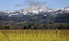
 캐나다, 서부해안 연결 신규 파이프라인 이르…
 - 29
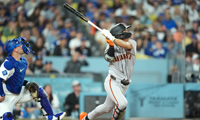
 “이강인+현금 바칠게” 거물 공격수에 눈먼 …
 - 30
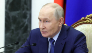
 푸틴, 19∼20일 중국 국빈방문…트럼프 방…


![[후보등록]](http://image.koreatimes.com//manage/la/images/top2/1778890710_top2_image_3.jpg)


오피니언

음주운전, 더 이상은 안된다
-
투표는 권리이자 한인사회의 힘
 김정곤 서울경제 논설위원
[만화경] K증시의 꿈 ‘한국판 골드만삭스’
- 정재왈 서울시립교향악단 대표
[로터리] 대타 연주자가 홈런을 치는 순간
- 이영태 한국일보 논설위원
[지평선] ‘스페이스K’ 탄생의 꿈
- 이리나 수필가
[윌셔에서] 망치 소리에 깨어난 인생 2막
 정숙희 논설위원
디지털 시대의 아날로그 인간
 파리드 자카리아
 미국은 왜 이란을 굴복시키지 못하는가
- 성영라 수필가 미주문협 부이사장
[수요에세이] 천사가 지나가기를 바라며
1/3
지사별 뉴스

미·중 정상회담… ‘황제의 제단’ 앞에 선 트럼프와 시진핑
도널드 트럼프 대통령과 시진핑 중국 국가주석이 14일(현지시간) 베이징 인민대회당에서 미·중 정상회담을 가진 후 텐탄(천단) 공원으로 자리를 …
불체자 식별 위해 ‘ITIN(납세자 번호) 발급’ 개편 추진

“보험청구 마구잡이 삭감 안돼”
버지니아 주하원 아이린 신(Irene Shin) 의원이 발의한 ‘AI 부당 다운코딩 방지법’(HB 484)을 비롯해 일련의 건강보험 개혁법안들…
덜레스 공항 220억 달러 재건축

트럼프 “대만에 무기 팔수도, 안 팔수도…대만 반도체 美 오길”
베이징 미중 정상회담을 마친 도널드 트럼프 대통령이 대만에 대한 무기 판매는 “좋은 협상칩”이라며 미국이 팔 수도, 팔지 않을 수도 있다고 말…
글로벌 어린이재단 SF지부, 어린이 돕기 골프대회


 | ||
|


- 로그인
- 회원가입
Koreatimes.com 서비스는 Ktown1st.com과 통합계정입니다. 계정이 없으신 분은 회원가입을 해 주세요.
.png)


댓글 안에 당신의 성숙함도 담아 주세요.
'오늘의 한마디'는 기사에 대하여 자신의 생각을 말하고 남의 생각을 들으며 서로 다양한 의견을 나누는 공간입니다. 그러나 간혹 불건전한 내용을 올리시는 분들이 계셔서 건전한 인터넷문화 정착을 위해 아래와 같은 운영원칙을 적용합니다.
자체 모니터링을 통해 아래에 해당하는 내용이 포함된 댓글이 발견되면 예고없이 삭제 조치를 하겠습니다.
불건전한 댓글을 올리거나, 이름에 비속어 및 상대방의 불쾌감을 주는 단어를 사용, 유명인 또는 특정 일반인을 사칭하는 경우 이용에 대한 차단 제재를 받을 수 있습니다. 차단될 경우, 일주일간 댓글을 달수 없게 됩니다.
명예훼손, 개인정보 유출, 욕설 등 법률에 위반되는 댓글은 관계 법령에 의거 민형사상 처벌을 받을 수 있으니 이용에 주의를 부탁드립니다.
Close
x